
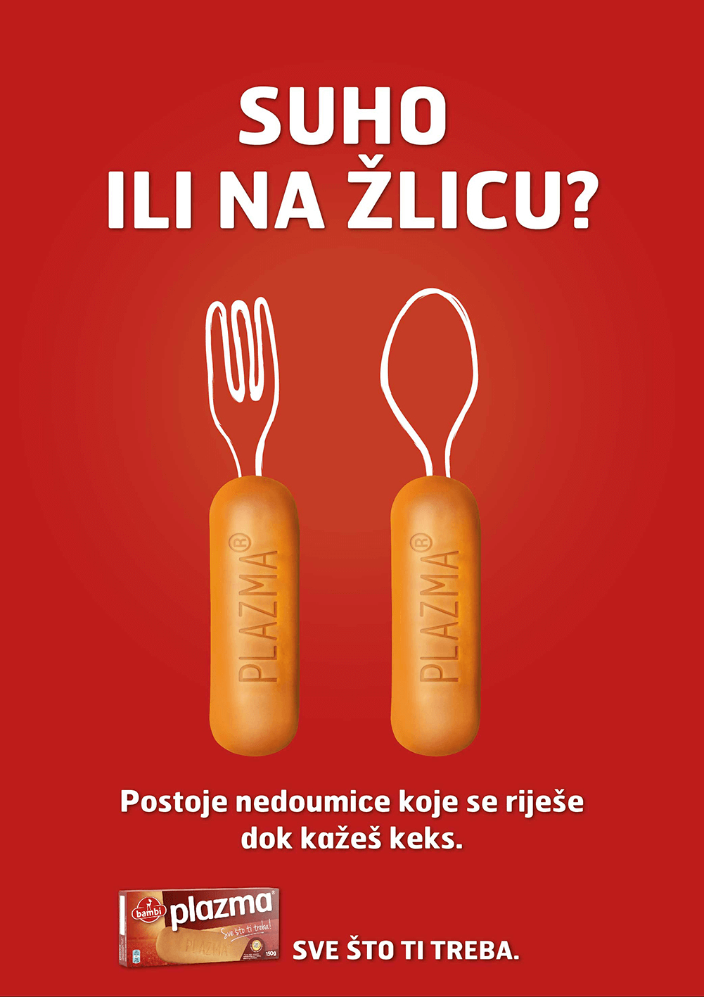
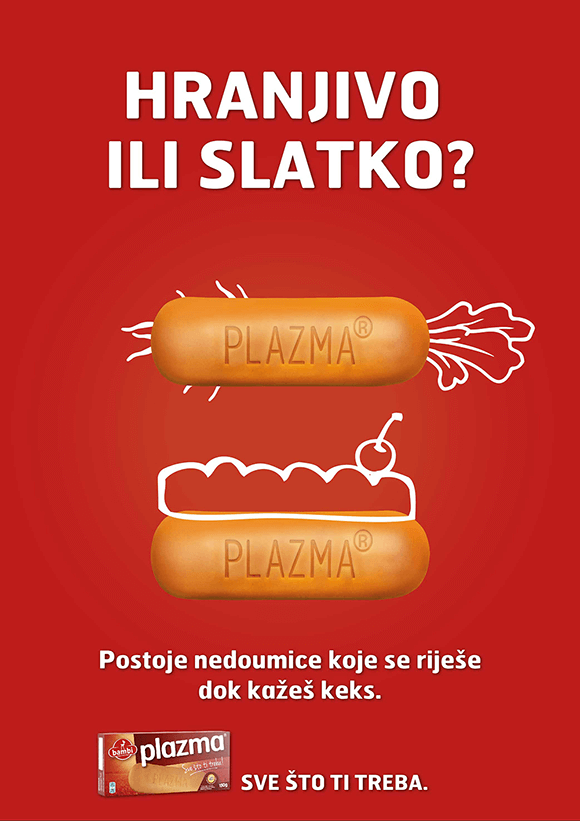
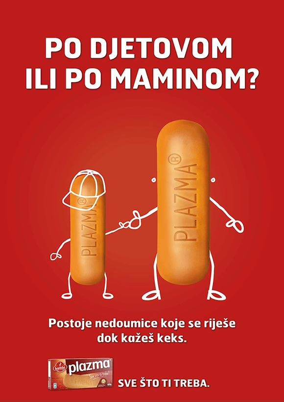
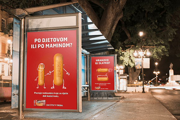
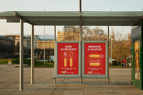
These are the proposals of visuals for the brand campaign for Plazma, famous Serbian biscuit brand. I was responsible for art direction and graphic design. (After I left the agency and the campaign was about to begin, the final designs were slightly modified.)The name of the campaign is “Dilemmas” as the Plazma biscuits can be consumed both grounded or whole, can be used for making desserts or eaten the way they are….
There are three headlines and each address a different dilemma. The first one says: “Nutritious or sweet?”. Second one : “With a fork or with a spoon?” meaning: to eat something solid or something liquid. Finally, the third headline says: “Kid’s way or mom’s way?”
I used the biscuit as the main visual element and added the illustrated elements to correspond to the headline. The result is eye- catching, simple yet fun design that unites headline, visual and brand.
Credits:
agency: BBDO Zagreb
graphic designer: Marija Knezić Marichoo
copywriter: Miro Peric
photos, illustrations: Plazma, Shutterstock